
Case Study: Brand Identity + Website Redesign for Hopko Art Glass
Overview
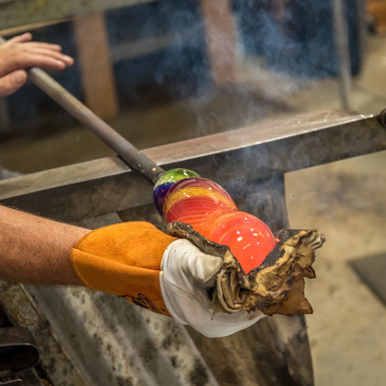
Hopko Art Glass is a contemporary glass art studio seeking to elevate its online presence to match the quality, craftsmanship, and storytelling of its work. The goal was to create a brand identity and digital experience that feels as luminous, precise, and emotionally resonant as the art itself — one that helps the artist connect more deeply with collectors, galleries, and art communities globally.
Challenge
Hopko Art Glass’s existing website was functional but lacked cohesion: visual branding was inconsistent, messaging didn’t clearly communicate the artistic intent and value proposition, and the user experience didn’t guide visitors into meaningful engagement or sales pathways. The primary challenge was to craft an identity and digital narrative that felt bespoke — reflecting both artistic integrity and market clarity.
Scope of Work
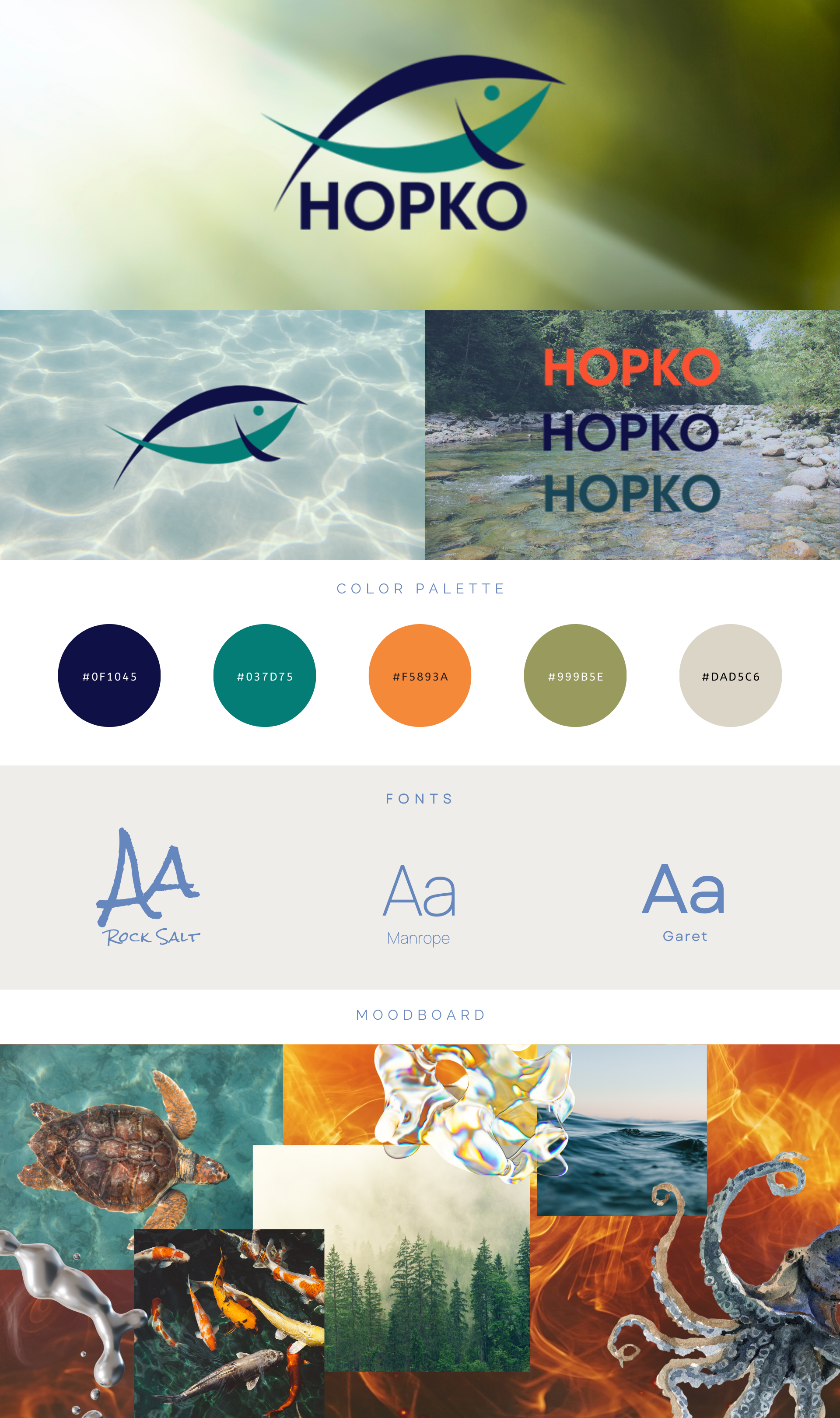
Brand Identity Development:
We started with discovery meetings to understand artistic philosophy, audience profiles, and long-term business goals. From there, we developed visual language — including messaging refinements, color palette expansion, typography systems, and texture/motif explorations — that mirror the translucency and nuance of glass art.Complete Website Redesign:
A strategic site architecture was built to elevate the art-first experience. Key priorities included simplified navigation, immersive galleries, and a storytelling framework that turns every piece into an emotional encounter.Content Rewrite (SEO + Narrative Focus):
Messaging was rewritten with dual purposes: clarity for search engines and resonance for human readers. Artist statements, collection descriptions, and about/mission copy were refined to balance artistry with accessibility, driving both discovery and conversion.
Process & Strategy
Discovery + Audit: We audited the current brand assets and website performance to identify gaps and opportunities.
Identity Workshop: Collaborative sessions surfaced themes — luminosity, craft, legacy — that became core pillars of the new identity.
Wireframes to Visual Design: Wireframes established structural clarity; visual design injected emotion and visual continuity.
Copy Strategy: We applied storytelling principles, persuasive copywriting, and SEO best practices to all written content.
Launch + Optimization Plan: Post-launch performance tracking to refine CTAs, on-page engagement, and conversion paths.
Results & Impact
A brand presence that communicates artistic depth while aligning with commercial goals.
A website that feels like a gallery — immersive, intuitive, and optimized for discovery.
Messaging that frames each work as collectible, narratively rich, and shareable.